a bordered box per list item
two labelled areas to sort into
If the strips spill onto a second page, lower --strip-pad in the print
block below. That is the one number worth touching.
--------------------------------------------------------------------------- */
.page-break {
break-before: page;
page-break-before: always;
}
.cut-strips {
--strip-pad: 0.34rem;
margin: 1.25rem 0;
}
.cut-strips ul {
list-style: none;
padding-left: 0;
margin: 0;
}
.cut-strips li {
border: 1px dashed #888;
border-radius: 3px;
padding: var(--strip-pad) 0.6rem;
margin: 0.28rem 0;
/* never let a strip be split across a page break */
break-inside: avoid;
page-break-inside: avoid;
}
/* the strips are code, but mdBook's code background fights the strip border */
.cut-strips li code {
background: none;
padding: 0;
}
.worksheet {
display: flex;
gap: 0.35in;
margin-top: 0.2in;
}
.worksheet-col {
flex: 1;
min-width: 0;
}
.worksheet-col > strong {
display: block;
margin-bottom: 0.1in;
}
.worksheet-box {
border: 1px solid #888;
border-radius: 4px;
min-height: 4in;
}
@media print {
/* Activity 3 has 23 strips. At these values each one is about 0.37in, so
the set comes to roughly 8.6in and lands on a single sheet. Screen
padding would put it near 15in, which is three pages of strips.
Raise --strip-pad for fewer, chunkier strips; lower it for more. */
.cut-strips {
--strip-pad: 0.07in;
font-size: 10pt;
line-height: 1.25;
}
.cut-strips li {
margin: 0.02in 0;
border-color: #444;
}
.worksheet-box {
min-height: 6.4in;
border-color: #444;
}
}
/* ---------------------------------------------------------------------------
Write-in space on the printout
---------------------------------------------------------------------------
Announcements change the morning of, but handouts print days ahead. Rather
than reprinting, leave ruled space and let students write the announcements
in themselves. Copying them down beats reading them, so this is worth more
than the reprint it saves.
` per line, so the number of lines is visible in the markup. Keep them on one line: a blank line inside the div ends the raw HTML block. --------------------------------------------------------------------------- */ .write-in { display: none; } @media print { .write-in { display: block; margin: 0.12in 0 0.2in; } /* One
per line, and the rules are borders rather than a background gradient. Browsers print with "Background graphics" OFF by default, so the gradient version came out blank or partial on a Cmd-P handout; print-color-adjust: exact did not rescue it, tried 2026-09-13. Borders print either way. Headless Chrome prints backgrounds regardless, so a render that looks right is not evidence the paper will be: check a real print preview. The margin sits above each rule, so the gap is the space you write in and the rule is the line you write on. */ .write-in hr { border: 0; border-top: 1px solid #999; height: 0; margin: 0.32in 0 0; break-inside: avoid; page-break-inside: avoid; } } /* --------------------------------------------------------------------------- Teaching staff grid --------------------------------------------------------------------------- Replaces the PowerPoint composite that fa25 used. Photos come in at different aspect ratios (some square, some 3:4), so every one is forced into the same portrait box with object-fit: cover. Nothing needs recropping; swapping a photo means dropping a new file in and changing the src. object-position sits high so a cover-crop takes it off the chin, not the forehead. Raise the percentage for a photo framed unusually tight. Groups wrap as units, so a narrow window never splits a section across two rows. --------------------------------------------------------------------------- */ .staff { display: flex; flex-wrap: wrap; justify-content: center; align-items: flex-start; gap: 1.4rem 2rem; margin: 1.5rem 0; } .staff-group-title { font-size: 0.78rem; font-weight: 600; letter-spacing: 0.06em; text-transform: uppercase; opacity: 0.6; text-align: center; margin-bottom: 0.5rem; } .staff-people { display: flex; gap: 0.7rem; justify-content: center; } .staff figure { margin: 0; width: clamp(5rem, 10vw, 9rem); } .staff img { display: block; width: 100%; aspect-ratio: 3 / 4; object-fit: cover; object-position: center 22%; border-radius: 6px; } .staff figcaption { text-align: center; font-size: 0.82rem; line-height: 1.25; margin-top: 0.3rem; } .staff figcaption span { display: block; font-size: 0.72rem; opacity: 0.6; } @media print { .staff { gap: 0.5rem 1rem; } .staff figure { width: 1.05in; } .staff figcaption { font-size: 8pt; } .staff-group-title { font-size: 7pt; } .staff > div { break-inside: avoid; } } /* --------------------------------------------------------------------------- Lecture cover images --------------------------------------------------------------------------- One image under the lecture's H1, sized differently in each of the three views. No build flag: the image lives in the body and renders everywhere, and only its size changes. # Lecture 4 - Hello git: save points for your code Slides: large, so the title slide is not a mostly-empty page.
That rule is in slides.css, not here.
Website: a header image, capped so it does not dominate the page.
Handout: a thumbnail. Students carry a stack of stapled packets, and a
distinct picture on page 1 is how you find lecture 12 without
reading titles. Small enough that it costs almost no paper.
Two rules for the images themselves:
1. **No text baked into the picture.** The H1 sits right above it, so text
in the image duplicates it, does not scale, and is invisible to a screen
reader. Use the `alt` attribute to say what it shows.
2. **Same aspect ratio every time**, 16:9. If it varies, the title slide
jumps around from lecture to lecture and the effect is lost.
--------------------------------------------------------------------------- */
.lecture-cover {
display: block;
width: 100%;
/* !important because mdBook's general.css has `.content img { max-width: 100% }`,
which is more specific than a bare class and would otherwise win. */
max-width: 34rem !important;
height: auto;
margin: 1rem 0 1.5rem;
border-radius: 6px;
}
@media print {
.lecture-cover {
max-width: 2.6in !important; /* about 1.5in tall at 16:9 */
margin: 0.15in 0 0.25in;
}
}
/* ---------------------------------------------------------------------------
Images that shrink on paper
---------------------------------------------------------------------------
For pictures that earn their space on the slide and on the website but would
eat a third of a printed page. Screenshots, jokes, and anything whose job is
recognition rather than reading. Full size on screen, thumbnail on paper, so
the packet keeps the visual cue without the page count.
This is the alternative to hiding something from the handout. Nothing
disappears, so the printout stays "the website page on paper" and there is
no third view to keep track of.
Do NOT use it on a diagram students need to read on paper. Those stay full
width: file system trees, memory layouts, permission tables.
Markdown carries no class, so write these as HTML:
Slides: large, so the title slide is not a mostly-empty page.
That rule is in slides.css, not here.
Website: a header image, capped so it does not dominate the page.
Handout: a thumbnail. Students carry a stack of stapled packets, and a
distinct picture on page 1 is how you find lecture 12 without
reading titles. Small enough that it costs almost no paper.
Two rules for the images themselves:
1. **No text baked into the picture.** The H1 sits right above it, so text
in the image duplicates it, does not scale, and is invisible to a screen
reader. Use the `alt` attribute to say what it shows.
2. **Same aspect ratio every time**, 16:9. If it varies, the title slide
jumps around from lecture to lecture and the effect is lost.
--------------------------------------------------------------------------- */
.lecture-cover {
display: block;
width: 100%;
/* !important because mdBook's general.css has `.content img { max-width: 100% }`,
which is more specific than a bare class and would otherwise win. */
max-width: 34rem !important;
height: auto;
margin: 1rem 0 1.5rem;
border-radius: 6px;
}
@media print {
.lecture-cover {
max-width: 2.6in !important; /* about 1.5in tall at 16:9 */
margin: 0.15in 0 0.25in;
}
}
/* ---------------------------------------------------------------------------
Images that shrink on paper
---------------------------------------------------------------------------
For pictures that earn their space on the slide and on the website but would
eat a third of a printed page. Screenshots, jokes, and anything whose job is
recognition rather than reading. Full size on screen, thumbnail on paper, so
the packet keeps the visual cue without the page count.
This is the alternative to hiding something from the handout. Nothing
disappears, so the printout stays "the website page on paper" and there is
no third view to keep track of.
Do NOT use it on a diagram students need to read on paper. Those stay full
width: file system trees, memory layouts, permission tables.
Markdown carries no class, so write these as HTML:
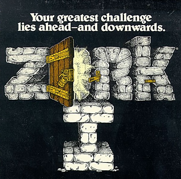 --------------------------------------------------------------------------- */
.print-small {
display: block;
max-width: 100%;
height: auto;
}
@media print {
.print-small {
/* !important: mdBook's `.content img { max-width: 100% }` is more
specific than a bare class and wins without it. */
max-width: 2.2in !important;
margin: 0.1in 0 0.2in;
}
}
/* ---------------------------------------------------------------------------
Images at a third of the column
---------------------------------------------------------------------------
For a small screenshot whose job is "here is the button I mean". A UI
element photographed at full column width reads as the subject of the page
rather than a pointer to something on someone else's screen.
Unlike `.print-small`, this one is small in every view, on screen and on
paper, because the picture was never worth the space to begin with.
Markdown carries no class, so write these as HTML:
--------------------------------------------------------------------------- */
.print-small {
display: block;
max-width: 100%;
height: auto;
}
@media print {
.print-small {
/* !important: mdBook's `.content img { max-width: 100% }` is more
specific than a bare class and wins without it. */
max-width: 2.2in !important;
margin: 0.1in 0 0.2in;
}
}
/* ---------------------------------------------------------------------------
Images at a third of the column
---------------------------------------------------------------------------
For a small screenshot whose job is "here is the button I mean". A UI
element photographed at full column width reads as the subject of the page
rather than a pointer to something on someone else's screen.
Unlike `.print-small`, this one is small in every view, on screen and on
paper, because the picture was never worth the space to begin with.
Markdown carries no class, so write these as HTML:
 Below 700px the column is narrow enough that a third of it is unreadable,
so the image goes back to full width.
--------------------------------------------------------------------------- */
.third-width {
display: block;
/* !important because mdBook's general.css has `.content img { max-width: 100% }`,
which is more specific than a bare class and would otherwise win. */
max-width: 33% !important;
height: auto;
margin: 0.75rem 0 1rem;
}
@media (max-width: 700px) {
.third-width {
max-width: 100% !important;
}
}
/* ---------------------------------------------------------------------------
QR codes
---------------------------------------------------------------------------
For a link students need to open on a phone mid-class, where typing a URL
off the screen wastes two minutes and produces three typos.
Sized differently in each of the three views, like .lecture-cover, and for
the same reason: the image lives in the body with no build flag, so it is
one line in the lecture file and only its size changes.
Slides: large. The slide sits on the projector for the whole activity and
the back row has to scan it. That rule is in slides.css.
Website: modest. The link next to it is clickable here, so the code is a
convenience rather than the point.
Handout: small, but never below about 1.2in or a phone stops finding it on
paper at arm's length.
Always put the URL next to the code as text too. A QR is unreadable to
anyone whose camera is not working, and it tells a screen reader nothing.
Markdown carries no class, so write these as HTML:
Below 700px the column is narrow enough that a third of it is unreadable,
so the image goes back to full width.
--------------------------------------------------------------------------- */
.third-width {
display: block;
/* !important because mdBook's general.css has `.content img { max-width: 100% }`,
which is more specific than a bare class and would otherwise win. */
max-width: 33% !important;
height: auto;
margin: 0.75rem 0 1rem;
}
@media (max-width: 700px) {
.third-width {
max-width: 100% !important;
}
}
/* ---------------------------------------------------------------------------
QR codes
---------------------------------------------------------------------------
For a link students need to open on a phone mid-class, where typing a URL
off the screen wastes two minutes and produces three typos.
Sized differently in each of the three views, like .lecture-cover, and for
the same reason: the image lives in the body with no build flag, so it is
one line in the lecture file and only its size changes.
Slides: large. The slide sits on the projector for the whole activity and
the back row has to scan it. That rule is in slides.css.
Website: modest. The link next to it is clickable here, so the code is a
convenience rather than the point.
Handout: small, but never below about 1.2in or a phone stops finding it on
paper at arm's length.
Always put the URL next to the code as text too. A QR is unreadable to
anyone whose camera is not working, and it tells a screen reader nothing.
Markdown carries no class, so write these as HTML:
 --------------------------------------------------------------------------- */
.qr-code {
display: block;
/* !important because mdBook's general.css has `.content img { max-width: 100% }`,
which is more specific than a bare class and would otherwise win. */
max-width: 13rem !important;
height: auto;
margin: 1rem 0;
}
@media print {
.qr-code {
max-width: 1.6in !important;
margin: 0.15in 0;
}
}
--------------------------------------------------------------------------- */
.qr-code {
display: block;
/* !important because mdBook's general.css has `.content img { max-width: 100% }`,
which is more specific than a bare class and would otherwise win. */
max-width: 13rem !important;
height: auto;
margin: 1rem 0;
}
@media print {
.qr-code {
max-width: 1.6in !important;
margin: 0.15in 0;
}
}
**Announcements**
Nothing on screen or on the slides. Ruled lines when printed. One `` per line, so the number of lines is visible in the markup. Keep them on one line: a blank line inside the div ends the raw HTML block. --------------------------------------------------------------------------- */ .write-in { display: none; } @media print { .write-in { display: block; margin: 0.12in 0 0.2in; } /* One
per line, and the rules are borders rather than a background gradient. Browsers print with "Background graphics" OFF by default, so the gradient version came out blank or partial on a Cmd-P handout; print-color-adjust: exact did not rescue it, tried 2026-09-13. Borders print either way. Headless Chrome prints backgrounds regardless, so a render that looks right is not evidence the paper will be: check a real print preview. The margin sits above each rule, so the gap is the space you write in and the rule is the line you write on. */ .write-in hr { border: 0; border-top: 1px solid #999; height: 0; margin: 0.32in 0 0; break-inside: avoid; page-break-inside: avoid; } } /* --------------------------------------------------------------------------- Teaching staff grid --------------------------------------------------------------------------- Replaces the PowerPoint composite that fa25 used. Photos come in at different aspect ratios (some square, some 3:4), so every one is forced into the same portrait box with object-fit: cover. Nothing needs recropping; swapping a photo means dropping a new file in and changing the src. object-position sits high so a cover-crop takes it off the chin, not the forehead. Raise the percentage for a photo framed unusually tight. Groups wrap as units, so a narrow window never splits a section across two rows. --------------------------------------------------------------------------- */ .staff { display: flex; flex-wrap: wrap; justify-content: center; align-items: flex-start; gap: 1.4rem 2rem; margin: 1.5rem 0; } .staff-group-title { font-size: 0.78rem; font-weight: 600; letter-spacing: 0.06em; text-transform: uppercase; opacity: 0.6; text-align: center; margin-bottom: 0.5rem; } .staff-people { display: flex; gap: 0.7rem; justify-content: center; } .staff figure { margin: 0; width: clamp(5rem, 10vw, 9rem); } .staff img { display: block; width: 100%; aspect-ratio: 3 / 4; object-fit: cover; object-position: center 22%; border-radius: 6px; } .staff figcaption { text-align: center; font-size: 0.82rem; line-height: 1.25; margin-top: 0.3rem; } .staff figcaption span { display: block; font-size: 0.72rem; opacity: 0.6; } @media print { .staff { gap: 0.5rem 1rem; } .staff figure { width: 1.05in; } .staff figcaption { font-size: 8pt; } .staff-group-title { font-size: 7pt; } .staff > div { break-inside: avoid; } } /* --------------------------------------------------------------------------- Lecture cover images --------------------------------------------------------------------------- One image under the lecture's H1, sized differently in each of the three views. No build flag: the image lives in the body and renders everywhere, and only its size changes. # Lecture 4 - Hello git: save points for your code
Slides: large, so the title slide is not a mostly-empty page.
That rule is in slides.css, not here.
Website: a header image, capped so it does not dominate the page.
Handout: a thumbnail. Students carry a stack of stapled packets, and a
distinct picture on page 1 is how you find lecture 12 without
reading titles. Small enough that it costs almost no paper.
Two rules for the images themselves:
1. **No text baked into the picture.** The H1 sits right above it, so text
in the image duplicates it, does not scale, and is invisible to a screen
reader. Use the `alt` attribute to say what it shows.
2. **Same aspect ratio every time**, 16:9. If it varies, the title slide
jumps around from lecture to lecture and the effect is lost.
--------------------------------------------------------------------------- */
.lecture-cover {
display: block;
width: 100%;
/* !important because mdBook's general.css has `.content img { max-width: 100% }`,
which is more specific than a bare class and would otherwise win. */
max-width: 34rem !important;
height: auto;
margin: 1rem 0 1.5rem;
border-radius: 6px;
}
@media print {
.lecture-cover {
max-width: 2.6in !important; /* about 1.5in tall at 16:9 */
margin: 0.15in 0 0.25in;
}
}
/* ---------------------------------------------------------------------------
Images that shrink on paper
---------------------------------------------------------------------------
For pictures that earn their space on the slide and on the website but would
eat a third of a printed page. Screenshots, jokes, and anything whose job is
recognition rather than reading. Full size on screen, thumbnail on paper, so
the packet keeps the visual cue without the page count.
This is the alternative to hiding something from the handout. Nothing
disappears, so the printout stays "the website page on paper" and there is
no third view to keep track of.
Do NOT use it on a diagram students need to read on paper. Those stay full
width: file system trees, memory layouts, permission tables.
Markdown carries no class, so write these as HTML:
--------------------------------------------------------------------------- */
.print-small {
display: block;
max-width: 100%;
height: auto;
}
@media print {
.print-small {
/* !important: mdBook's `.content img { max-width: 100% }` is more
specific than a bare class and wins without it. */
max-width: 2.2in !important;
margin: 0.1in 0 0.2in;
}
}
/* ---------------------------------------------------------------------------
Images at a third of the column
---------------------------------------------------------------------------
For a small screenshot whose job is "here is the button I mean". A UI
element photographed at full column width reads as the subject of the page
rather than a pointer to something on someone else's screen.
Unlike `.print-small`, this one is small in every view, on screen and on
paper, because the picture was never worth the space to begin with.
Markdown carries no class, so write these as HTML:
Below 700px the column is narrow enough that a third of it is unreadable,
so the image goes back to full width.
--------------------------------------------------------------------------- */
.third-width {
display: block;
/* !important because mdBook's general.css has `.content img { max-width: 100% }`,
which is more specific than a bare class and would otherwise win. */
max-width: 33% !important;
height: auto;
margin: 0.75rem 0 1rem;
}
@media (max-width: 700px) {
.third-width {
max-width: 100% !important;
}
}
/* ---------------------------------------------------------------------------
QR codes
---------------------------------------------------------------------------
For a link students need to open on a phone mid-class, where typing a URL
off the screen wastes two minutes and produces three typos.
Sized differently in each of the three views, like .lecture-cover, and for
the same reason: the image lives in the body with no build flag, so it is
one line in the lecture file and only its size changes.
Slides: large. The slide sits on the projector for the whole activity and
the back row has to scan it. That rule is in slides.css.
Website: modest. The link next to it is clickable here, so the code is a
convenience rather than the point.
Handout: small, but never below about 1.2in or a phone stops finding it on
paper at arm's length.
Always put the URL next to the code as text too. A QR is unreadable to
anyone whose camera is not working, and it tells a screen reader nothing.
Markdown carries no class, so write these as HTML:
--------------------------------------------------------------------------- */
.qr-code {
display: block;
/* !important because mdBook's general.css has `.content img { max-width: 100% }`,
which is more specific than a bare class and would otherwise win. */
max-width: 13rem !important;
height: auto;
margin: 1rem 0;
}
@media print {
.qr-code {
max-width: 1.6in !important;
margin: 0.15in 0;
}
}